Ordering on UberEats feels like navigating an airport without signs
Role
Primary UX/UI Researcher
Skills
UX Research, User Testing, Heuristic Evaluation
Duration
10 weeks, Winter 2025

1. The Problem
UberEats is designed to make food delivery fast and convenient, connecting users with local restaurants at the tap of a button. The promise is simple: a seamless dining experience without leaving home.
But imagine a food delivery service where finding a meal was truly effortless, pricing was transparent, and checkout was clear—no second-guessing, no hidden fees, just a smooth ordering experience.
The reality? Ordering on UberEats feels like navigating an airport without signs. Experienced users rely on learned shortcuts just to complete basic tasks, while both new and frequent users face unnecessary friction at every turn.
The Challenge
"How might we make UberEats more intuitive and transparent, ensuring users can easily find what they need and understand costs without unnecessary friction?"

2. Research Approach
To understand why UberEats users experience friction while ordering, we examined the core issues impacting navigation, transparency, and overall user experience. We analyzed who our main users are, how they interact with the platform, and how UberEats compares to competitors in the food delivery space.
Our Research Framework
🔍 Competitive Landscape
We compared UberEats to leading competitors such as DoorDash, Grubhub, Postmates, and McDonald's—evaluating their app store ratings, unique features, and approaches to pricing transparency.
💬 User Voices
We conducted 22 user interviews to gather insights from real users, identifying key frustrations and recurring themes in their ordering process.
📊 Pain Point Mapping
We performed heuristic evaluations and mapped where friction occurs in the user journey, measuring severity to prioritize areas for improvement.
By gathering insights from real users and industry benchmarks, we identified key friction points that disrupt the ordering experience, insights that guided our approach to making UberEats a more intuitive, transparent, and user, friendly platform.
3. What We Discovered
Competitive Analysis: The Landscape
Our research revealed a critical insight: DoorDash dominates user preference, with 80% of survey respondents choosing it as their preferred food delivery service. UberEats ranked #3 in the App Store's Food & Drink category, indicating strong market presence but room for improvement.
Key Competitive Findings:
DoorDash (80% user preference)
Clearer pricing transparency upfront
More intuitive navigation structure
Stronger brand loyalty
Grubhub
Founded 2004, established market presence
Revenue from restaurant commissions and delivery fees
Mixed user reviews on fee transparency
Postmates (Direct Competitor)
Nearly identical UI to Uber Eats
Surge pricing model
Less specialized, delivers food and other goods
Focus on bigger cities
UberOne heavily promoted throughout app
Opportunity Gap: UberEats has significant opportunity to differentiate through improved transparency, personalization, and navigation—areas where competitors still struggle but where UberEats can lead.
User Voices: What Real Users Are Saying
Through 22 user interviews, we uncovered powerful insights into the UberEats experience. Here's what users told us:
On Choice Overload:
"It's like Netflix... you just keep scrolling and scrolling"
On Search Functionality:
"If I search cinnamon rolls, a pizza place pops up with cinnamon sticks"
On Visual Clutter:
"Featured/Promotions sections take up too much space—it's distracting"
What Works:
"Nearby" category is frequently used and valued
Map feature exists but is underutilized (users don't know about it)
Categories help reduce overwhelm when they're clear and organized
Survey Results:
We measured overall satisfaction with UberEats across 22 respondents. Ratings ranged from 2 to 10, with responses clustered around the middle range—indicating mixed satisfaction and significant room for improvement.

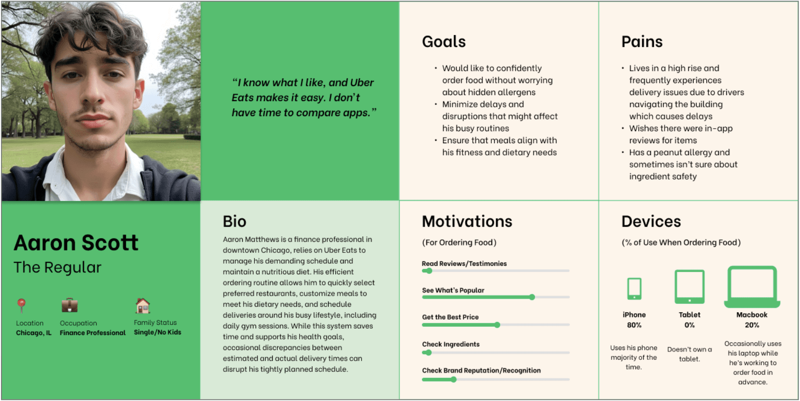
Meet the Users: Three Key Personas
By segmenting users into personas, we uncovered distinct needs, motivations, and pain points—from unclear delivery updates to difficulties in reordering. These personas represent the spectrum of UberEats users and their unique challenges.


Pain Points Mapped: Where Friction Lives
By mapping user pain points and their severity through heuristic evaluation, we gained a clearer understanding of where friction occurs in the UberEats experience. While both new and experienced users face challenges, certain frustrations stood out as critical obstacles to user trust and retention.
Critical Pain Points by User Type:
THE NEWBIE USER (Jordan)
🚨 Personalization & Discovery (Severity: 4/5)
Overwhelming number of restaurant options without guidance
Search results lack precision (e.g., searching "cinnamon rolls" returns pizza places)
No personalized recommendations for new users in unfamiliar areas
🚨 Pricing Transparency (Severity: 4/5)
Hidden fees appear at checkout
No clear cost breakdown before order confirmation
Unexpected charges erode trust
⚠️ System Navigation (Severity: 3/5)
Steep learning curve for first-time users
No effective onboarding process
Map feature exists but is hidden/underutilized
THE EXPERIENCED USER (Aaron & Lily)
🚨 Personalization & Discovery (Severity: 4/5)
No streamlined reorder functionality despite frequent use
Lack of saved dietary preferences or allergen filters
Decision fatigue from repetitive browsing
🚨 Pricing Transparency (Severity: 4/5)
Delivery fees still unclear even for regular users
Promotional pricing creates confusion
Total cost not visible until final checkout step
⚠️ System Navigation (Severity: 3/5)
Can't edit address after order submission (Severity: 4/5)
No "edit items" button, only "add items" (inconsistency)
No search function in help settings (Severity: 3/5)
Lack of visual/auditory feedback for successful actions
Additional Heuristic Findings:
Consistency Issues:
"Add items" vs. "Edit items" terminology inconsistent
Visual feedback missing for key actions
Error Prevention:
Can't modify address after submission (forces cancellation)
No confirmation for critical actions
Help & Documentation:
Help settings lack search functionality
Difficult to find answers to common questions

4. The Opportunity
These insights helped us assess UberEats' performance across key experience factors that influence customer trust, ease of use, and long-term engagement. We identified three strategic focus areas for improvement:
🎯 EASE OF USE
Goal: Simplify navigation and ordering to reduce friction and improve efficiency.
What We Found:
Users struggle with overwhelming choice without clear filtering
Search functionality lacks precision (irrelevant results)
Map feature exists but is underutilized due to poor visibility
No streamlined reorder process for frequent users
Can't edit address after order submission
Missing visual/auditory feedback for successful actions
Recommendations:
Optimize Search & Discovery
Improve search algorithm precision
Implement smart filtering based on user context
Surface the map feature more prominently
Streamline Reordering
Add one-tap reorder from order history
Save favorite restaurants and items
Create personalized "Quick Order" section
Improve System Feedback
Add visual confirmation for all key actions
Allow address editing after submission
Implement consistent "edit" vs. "add" terminology
Potential Impact: Faster ordering, reduced abandonment, improved satisfaction for both new and experienced users. Estimated 20-30% reduction in time-to-order.
🤝 BUILDING TRUST
Goal: Increase pricing clarity and minimize unexpected fees to strengthen user confidence.
What We Found:
Hidden fees appear at checkout, creating negative surprises
No clear cost breakdown visible during restaurant/item selection
Promotional pricing creates confusion
Users feel "tricked" by unexpected charges
80% of users prefer DoorDash, partly due to clearer pricing
Recommendations:
Transparent Cost Breakdown
Display all fees (delivery, service, taxes) upfront on restaurant pages
Show estimated total before adding items to cart
Provide clear explanations for each charge
Pricing Clarity Throughout Journey
Sticky price summary visible while browsing menu
No surprises at checkout—all costs shown earlier
Clear comparison of delivery vs. pickup costs
Build Trust Through Communication
Explain why fees vary (distance, demand, restaurant)
Highlight savings opportunities clearly
Provide price history for regular users
Potential Impact: Increased trust, reduced cart abandonment (estimated 15-25% improvement), higher completion rates, improved user satisfaction scores.
💚 DRIVING LOYALTY
Goal: Personalize the experience to keep users engaged and encourage repeat usage.
What We Found:
No personalized recommendations despite order history
Reordering is cumbersome even for frequent users
Dietary restrictions and allergen info difficult to find
New users in unfamiliar cities get no location-based guidance
Experienced users still face same friction as new users
Recommendations:
Smart Personalization
Recommend restaurants based on order history and preferences
Create personalized homepage for returning users
Suggest new restaurants similar to favorites
Saved Preferences & Dietary Filters
Allow users to save dietary restrictions (vegan, gluten-free, allergens)
Filter restaurants and menu items automatically
Display allergen information at item level
Context-Aware Features
Detect new locations and offer local recommendations
Adjust suggestions based on time of day and past patterns
Provide better onboarding for first-time users
Enhanced Reorder Experience
One-tap reorder from history
"Order Again" section on homepage
Save custom orders with modifications
Potential Impact: Increased repeat usage (estimated 30-40% improvement in retention), higher customer lifetime value, stronger brand loyalty, reduced reliance on promotions to drive orders.
5: Envisioning Solutions
Although this case study did not extend into prototyping, we created example screens to illustrate potential improvements based on our research insights. These mockups highlight opportunities to refine the user experience and could serve as a foundation for further exploration and iteration.
Our Usability Test Plan Focused on Three Key Features:
FEATURE 1: Personalized Recommendations and Search (2 mins)
The Problem:
Users like Lily and Jordan are overwhelmed by too many options without guidance. Search results lack precision, and new users in unfamiliar cities have no personalized recommendations.
The Solution:
Implement smart, context-aware recommendations and improved search functionality.
Key Improvements:
Personalized homepage based on order history and preferences
Location-aware suggestions for users in new cities
Improved search algorithm with precise, relevant results
Quick filters for dietary restrictions and price range
Test Questions:
How clear are the personalized recommendations?
Does the search functionality feel more precise?
Do you feel less overwhelmed by choices?
Research Connection: Addresses Lily's decision fatigue and Jordan's difficulty navigating in new areas (Severity 4/5 pain points).
FEATURE 2: Cost Breakdown Visibility (4 mins)
The Problem:
Both new and experienced users encounter unexpected fees at checkout. Lack of pricing transparency erodes trust and leads to cart abandonment.
The Solution:
Display all costs upfront with clear breakdowns throughout the ordering journey.
Key Improvements:
Visible cost breakdown on restaurant pages (before adding items)
Sticky price summary while browsing menu
Clear explanation of each fee (delivery, service, taxes)
No surprises at checkout—all costs shown earlier
Test Questions:
How confident do you feel about the total cost before checkout?
Are the fees clearly explained?
Do you feel more or less likely to complete your order?
Research Connection: Directly addresses the #1 trust issue for both Jordan and Aaron (Severity 4/5 pain point). Tackles the competitive disadvantage vs. DoorDash.
FEATURE 3: Optimized Navigation + Onboarding (6 mins)
The Problem:
New users face a steep learning curve. Experienced users can't efficiently reorder or edit key information. System lacks consistency and helpful feedback.
The Solution:
Streamlined navigation with effective onboarding for new users and efficiency features for experienced users.
Key Improvements:
Interactive onboarding for first-time users
One-tap reorder from order history
Ability to edit address after order submission
Prominent map feature for location-based discovery
Search functionality in help settings
Consistent visual/auditory feedback for actions
Test Questions:
How easy was it to navigate the app?
Did you feel guided or lost during the process?
How quickly could you complete your desired task?
Research Connection: Addresses navigation friction for all three personas (Severity 3-4/5 pain points). Improves both new user onboarding and experienced user efficiency.

6: Impact and Reflection
UberEats is successful, but our research revealed that even loyal customers face unnecessary friction. By improving transparency and navigation, UberEats can reduce user frustration, build trust, and increase repeat usage.
Key Takeaways:
🔍 Research Insight:
The most significant barrier to user satisfaction isn't the breadth of restaurant options—it's the lack of guidance and transparency in navigating those options. Users want personalization, not just more choices.
📊 Competitive Reality:
With 80% of survey respondents preferring DoorDash, UberEats faces a clear competitive challenge. However, our research identified specific, actionable areas where UberEats can differentiate: pricing transparency, personalized discovery, and streamlined reordering.
👥 User Diversity Matters:
Our three personas revealed that friction points vary significantly between new users, busy students, and experienced professionals. A one-size-fits-all approach won't work—solutions must be context-aware and adaptive.
🎯 Severity-Based Prioritization:
By rating pain points on a severity scale, we identified that pricing transparency and personalization are the highest-impact areas for improvement (both rated 4/5 severity across user types).
Other projects

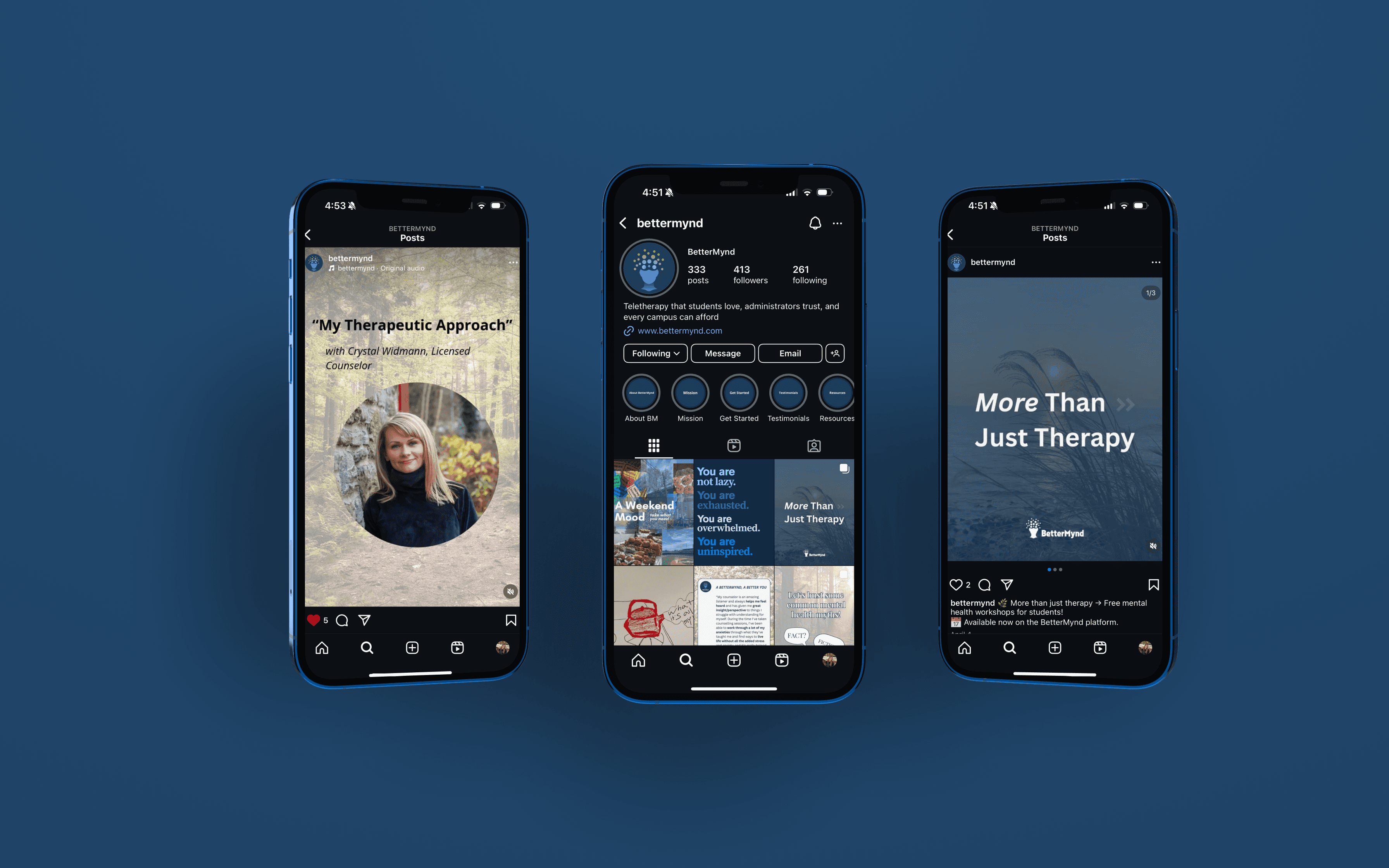
BetterMynd
Marketing
Project Management
BetterMynd is a social impact startup that provides access to mental health services for America’s 20 million college students.